From a Style Guide to
a Design System of Agostino Gemelli Policlinic (Italy)
Agostino Gemelli Polyclinic is the second-largest general hospital in Italy, the largest hospital in Rome and one of the largest private hospitals in Europe. The collaboration between Agostino Gemelli Polyclinic, Local Health Authority of Rome gave birth to a facility that provides palliative care services, today Gemelli Medical Center (GMC).
In 2022 GMC is opening a new building of the Gemelli Medical Care. Gemelli Polyclinic approaches changes in a holistic way and has a plan to renovate not only the physical environment but also the digital system, a system that includes a new identity, a landing page, a new website, a user's app and the system of wayfinding and signage on the physical site.

PROJECT TYPE
Design System
Style Guide
UI Design
Product Design
Web Design
App Design
Atomic Design
TEAM
Me, myself and I
MY RESPONSIBILITY
Design System
Style Guide
Atomic Design
TIME
1 month
I started the development of the digital design and identity for Gemelli Medical Center in July 2021 and led it for 6 months through direct communication with a client. My first step was the development of a style guide for a design system. It was important to create and develop a design system from the beginning of the project and use it for all the following steps and products because it lets:
-
design faster, due to predefined elements, components and patterns and reuse them as blocks;
-
develop faster and implement the design with more precise,
-
somebody else to continue your work easily and develop new features with the same style,
-
increase consistency between different products.
Further, I will present steps taken on the way to the design system: from the design guide including design principles, typeface selection, its scale, colour palette and layout to a design system defining its elements, components, patterns and screens.
,,
Dress me slowly, I am in a hurry.
Napoleon Bonaparte
1. Design Principles Definition
Each tangible solution needs an idea, a concept, a fundament in its base. This fundament is based on the value that the product brings to the users, on their needs, on what relives their pains and creates gains. Together with stakeholders, I conducted a workshop to define who are the users of the product, and their empathy maps. Together we defined guiding principles that reflect the mood and requirements for GMC digital experience. We defined design principles with words 'care, simplicity and life'.
2. Typeface Selection
As the majority of GMC users are middle-aged adults or old adults, all the separate elements and components, as well as the system as a whole, should be simple, clear and easy to perceive. The typeface family was chosen with this factor in mind. To read well on screens, especially small screens, we were choosing between typeface families designed for mobile phones and computers screens, sans serif fonts.
Montserrat typeface responded to our requirements being simple, modern and stable. Montserrat is very versatile and can be used in multiple domains such as websites, apps, branding, editorial, logos, print, posters, and we needed this versatility. It also has a wide variety of weights and styles.
Montserrat
CHARACTERS
Aa
VARIANTS
A B C D E F G H I J K L M N O P Q R S T U V W X Y Z
a b c d e f g h i j k l m n o p q r t s u v w x y z
( 0 1 2 3 4 5 6 7 8 9 ! @ # $ % ^ & *)
The quick brown fox jumped over the lazy dog.
The quick brown fox jumped over the lazy dog.
3. Typeface scale definition
Selecting a typeface scale for the site I were guided by the type of product we have (info/services website and app). For this digital product archetype, it was better to use a medium ratio of increase between different styles (1,125 Major Third not 1,333 or 1,414), which still provides a nice contrast between the levels of type but help reduce the length of a page.
I decided to use one font and not to pair it with another to keep things simple. I have started with the size of 16 pixels as a medium body text size and generated larger and smaller sizes that I used in texts from headings to captions by multiplying the following scale by 1,125. On the image above you see different sizes generated by this method and different scales that define text styles. Sizes go from small 14 px to xxxx-large 48 px with styles from regular to black they form 13 different styles: 4 heading styles for desktop, 4 heading styles for mobile and 5 common styles of subtitles, labels, bodies and captions.

4. Colour palette
We have a primary colour, a base colour that is used for buttons, links, for everything that has interaction. What I did is I generated a palette where it gradually gets a little darker, because this is useful for different states of the components. It is good to have variations of this primary colour. We also have a secondary colour, that is used for other things such as buttons that are less important, or for some headings.
A neutral colour palette is needed for backgrounds, divisions and for some texts. The feedback colour palette is made from standard colours that usually are used for feedback. These are colours to show success, warnings, additional information and errors. We need several shades to use for background, an icon or an edge of feedback. We need also background colours, primary, secondary and a helper.


Opacities with different levels of transparency could be used for dividing lines, for the background of a dialogue box, or a window. There are both variants, for a dark and light background. Next, we have shadows and gradients. I have created three different shadows: a soft, a medium and a strong one. So the soft could be used for a component like a card, the strong - for a dialogue, the medium could be the hover for the card.
Then we have applications. It defines how existing colours are applied to specific elements, such as different types of text and icons on light and dark backgrounds.


5. Layouts
What I did was the creation of different screen sizes that would be used in the project: one for mobile, one for a tablet or a small desktop screen, a bigger desktop screen and the biggest one. It was important also to define the grid for each of the screen types, from a 4-column grid for mobile to a 12-column grid for a big desktop screen. What also changes is the margin between the edge and left and right column.

6. Elements
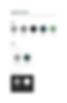
When we have a style guide, what we can do is to start designing elements that are the smallest blocks of a design system. They can be used separately or together with other parts designing the components. Our first group of elements are icons. I defined the variants of icons, different visually, not behaviourally; cases for different scenarios or moments of the same element, like enabled and disabled; and states provoked by user's interaction, like up, hover, focus and down.
The next element of a design system is buttons. I have defined how different types of buttons look like, primary and secondary; variants, like default and compact, and cases such as default, loading and disabled of primary and secondary types.

7. Components
The components are the building blocks of a design system, that are used most frequently. They can go from cards to fields of inputs, of different types (default, tile), variants (default, no footer, no header), cases (defaul, loading), states (up, tile, hoover) and responsive layouts.

8. Patterns
The patterns are a set of components, grouped with an intention to achieve a specific task or purpose. They are a part of the design system that acts as references but is still important for consistency. Patterns can be adapted to different processes and designers don't need to design a new screen each time it is needed.

9. Screens
I have designed a web page of GMC in three different sizes (mobile, tablet and desktop) using layouts, components and styles created before.

NOVEMBER 2021
Definition of GMC personas, their problems and needs, empathy maps, user journeys, information architecture and design principles.
DECEMBER 2021
Style guide design,
Design system design
Working closely with the multifunctional team of Agostino Gemelli Polyclinic in one month I have defined the requirements for the future design in different channels (mobile, tablet, desctop), designed a style guide and developed a design system on its basis. This design system is made to facilitate the work of other designers and developers working with the digital experience of GMC and increase consistency between different channels.