Streamer
App Design and Research for Streamer (Italy)
Project Type
UI Design
UX Design
UX Research
App Design
Mobile Design
Team
Me, myself and I
My Responsability
UI Design
UX Design
Information Architecture
UX Research
Hi-Fi Prototyping
Time
4 weeks
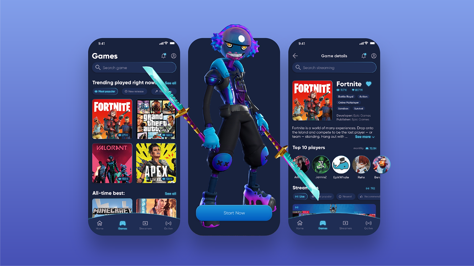
'Streamer' is a brand new gaming app. Its users can explore a massive library of video games, as well as browse a handy list of the most famous streamers online, following them, watching their streams and to subscribe to special content.
The UX research showed that potential users would like to arrive to the list of the following user stories:
1. to see a list of trending games being played right now
2. to see the newest and most popular titles being highlighted or otherwise indicated in the list of games
3. to be able to search for a game by title
4. to be able to follow a specific game to receive alerts and news
5. to be able to sort the streaming list by latest, recommended, and number of viewers
6. to be able to search for specific live streaming by name or tag
7. to be able to select a game title and see the following info:
-
short description,
-
game poster,
-
developer,
-
publisher,
-
genre,
-
number of followers,
-
streaming list,
-
number of current streamers,
-
list of game's top-rated players
8. to be able to create their own streaming channel, go live and earn by subscription of other users.

In the process of app creation, there was a need to test two very different user interfaces. Below you can see the images representing two different variants of the menu that allow users to navigate between different sections of the app.
-
Hamburger Menu (images 1 and 2). The first user interface is a list of available sections covering most of the screen. When the user taps on one of them, that section is expanded to take up the whole screen. A button (Menu Button) that allows the user to go back to the list of sections is displayed at the top-left corner at all times.
-
Tab Bar (image 3). The second user interface is a bar that's squeezed at the bottom of the screen, is visible all the time, and displays a button (tab) for each section. The user can move to another section by tapping on the relative tab in the bar.
We run tests of both user interfaces. We measured three things:
-
Engagement. The average time spent in the app by a user over the first week since they first installed it.
-
Retention. The percentage of users that are still active a week after they installed the app for the first time.
-
ARPD. The Average Revenue Per Download, or the total revenue generated on average by a user over their first week of usage.
Based on the information received the team was able to optimize the user interface and choose the one that gives a better experience for users and influence positively their activity.

Image 1. Hamburger Menu, step 1

Image 2. Hamburger Menu, step 2

Image 3. Tab Menu
March 2022
Design research, UX Design, UI Design, Prototyping, UX Research, User Testing
April 2022
Second phase of User Research and User Testing